Horror Vacui
Recently at Skynet HQ I was recommended the book Universal Principles of Design (Revised and Updated) by William Lidwell, Kritina Holden, and Jill Butler. As someone who has much to learn about aesthetic and the tested heuristics for which to think about building things, I gained a lot from reading this book. I liked it so much that I bought five extra copies and sent them to a few friends.
One reason I like the book so much is that you can read just a few pages at a time and learn something new every time you open the book. This is made possible through an intuitive layout: pages on the left-side introduce 1 of 125 design principles through clear and concise text, and on the right-side a real-world example displays the given design principle in action. The book’s explanation of Horror Vacui is one of my favorites.
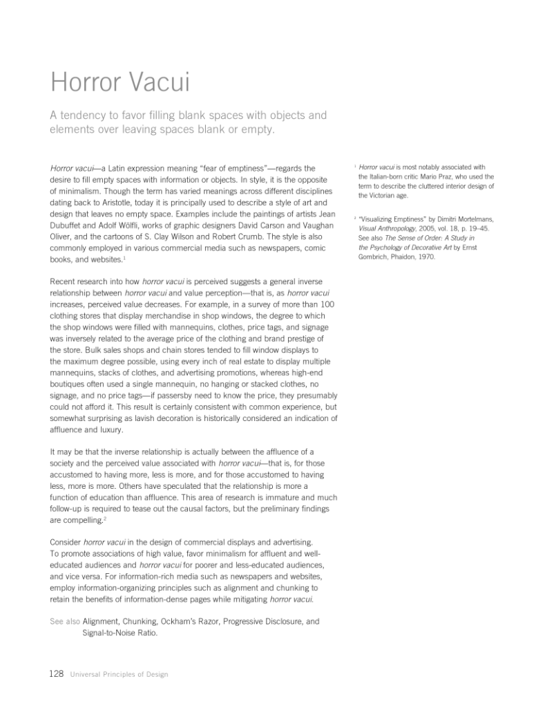
Horror vacui— a Latin expression meaning “fear of emptiness”—regards the desire to fill empty spaces with information or objects. In style it is the opposite of minimalism. Though the term has varied meanings across different disciplines dating back to Aristotle, today it is principally used to describe a style of art and design that leaves no empty space.
I enjoyed learning about Horror Vacui so much because this feeling describes the thoughts I’ve had myself when building websites in high school and my first product, Glider. Likewise, young entrepreneurs who come to me for feedback on their early prototypes often try to cram an excessive number of things into their space constraints. This feeling, Horror Vacui, is rooted in the value perception that more visible things is actually more valuable. However, as the book points out, this is a false perception; it is a feeling that often occurs due to a person’s lack of affluence, or a lack of education in aesthetics training.
It may be that the inverse relationship is actually between the affluence of a society and the perceived value associated with horror vacui— that is, for those accustomed to having more, less is more, and for those accustomed to having less, more is more.
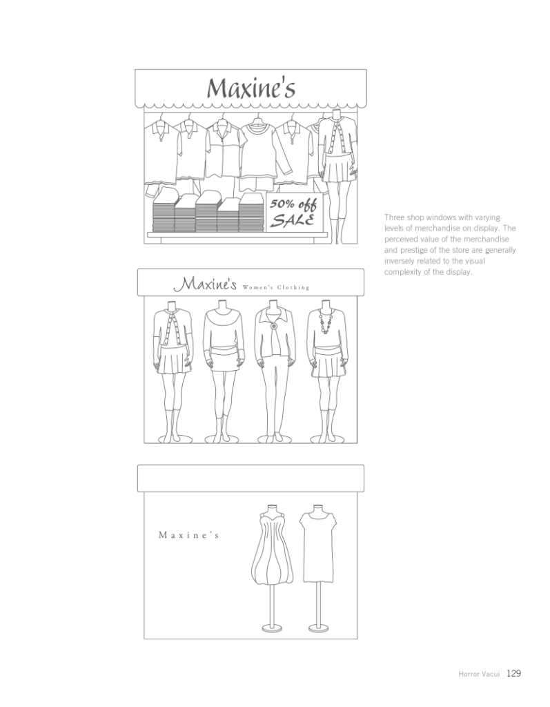
If your goal is to create a design that has associations of high perceived value, the book suggests, “favor minimalism for affluent and well-educated audiences and horror vacui for poorer and less-educated audiences, and vice versa”. Easy examples include the minimalist high-end shops of San Francisco’s Union Square, which stand in stark contrast to the over-filled display windows of the shops in San Francisco’s Chinatown. Ironically it is often the stuffy Chinatown shops that are selling faux versions of the products that for sale in the minimal Union Square shops. I wonder how a minimalist store in Chinatown would be perceived?
Here’s the full contents on Horror Vacui:


