Curb Appeal

Last week I was shopping on the historic Lincoln Road pedestrian mall in Miami Beach. It was the early afternoon and I had just begun feeling a hunger sensation as most of the walking space is filled with outdoor restaurants. This was my first time visiting the area and I had no knowledge of the local cuisine, since I opted out of using an app on my droid such as UrbanSpoon or Yelp. Trusting my instinct to find a tasty lunch, my friends and I began scoping out the surrounding restaurants. We had very little luck at first, only finding uninviting restaurants with more of a fancy dinner flavor. After a couple more blocks passed by, the hunger was increasing and we were not going to settle for plan B, the golden arches of McDonald’s. Eventually a familiar beat in the distance began catching my attention, but it was still mixed up in the clutter of several restaurants nearby.
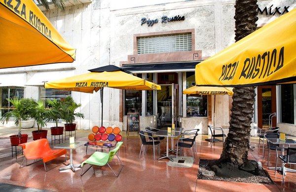
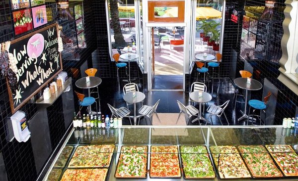
As we walked closer the vibrant colors of the outdoor tables and stylish décor immediately pulled me into the pizza restaurant, Pizza Rustica. The typical pizza customer can range from young kids to grandparents but in this area of Miami Beach, they had their target demographic hooked, the 18-30 crowd. Loud music projected from their compact kitchen and the pizza was plentiful. Not to mention another perk of this pizza place was that one slice was filling enough for lunch, allowing the customer to perceive that they are getting a great deal for one slice.

In other words, Pizza Rustica on Lincolnd Road has established a very attractive curb appeal. In a location where the majority of there customers are one-time-only as they visit Miami Beach, they understand the importance of pulling in as many customers as possible on their first impression. This same strategy applied by Pizza Rustica on a pedestrian mall can be applied to any website. Imagine the situation as a website:
- Lincoln road is the main thoroughfare where people are searching for a product/service. This can be Google/Yahoo/Bing or anywhere else where customers find your site advertised.
- The stylish décor outside is the attention-getting banner advertisement, or perhaps the well optimized site that is positioned to attract potential customers (organic traffic).
- Music being projected from inside is the alluring design elements on your landing page that entice the customer to click further into the website.
- The generic slice of pizza being slightly modified into a filling rectangle so that Pizza Rustica is distinguished is similar to marketing or packaging your product so it appears to be innovative.
- Thereby encouraging the customer want to share their experience with others.
_
Great work Pizza Rustica! When I did go onto Yelp later that day it was no surprise to see that Pizza Rustica is the most reviewed pizza place in Miami Beach and has received numerous awards for their delicious pizza. Does your site’s “curb appeal” pull in customers from the clutter of the online search funnels?
